
 How does an artist take a simple statement like
“Design a shoulder patch for the crew of Skylab
One,” and turn it into a picture that symbolizes the
works, hopes and dreams of the entire Skylab team?
How does an artist take a simple statement like
“Design a shoulder patch for the crew of Skylab
One,” and turn it into a picture that symbolizes the
works, hopes and dreams of the entire Skylab team?
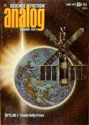
by Frank Kelly Freas
It was Ben Bova on the phone: “How would you like to do a shoulder patch for the first Skylab crew?”
“Love it.”
“Well, I gave them your address and phone number — if you don’t get word from them in a couple of days, call Commander Kerwin at this number ...”
Forty-seven hours and fifty-nine minutes later, I was on the phone to Houston: “About that shoulder patch ...”
Every artist has certain jobs in mind that he would pay for the chance to do, and this was one of mine. But right from the beginning Commander Kerwin made it clear that this was a commissioned job — not a gift. NASA can’t get involved in any commercial deals, and it doesn’t like being beholden to anybody either.
For any few that may not know, the astronauts of each of the Apollo shots have had designed and worn a shoulder patch that is distinctive of that shot alone. The insignia are primarily used for the fire-resistant cloth of the suits, but as every souvenir collector soon discovers, are also manufactured and sold as cloth patches to be sewn on shirts and jackets, as decals for notebooks, autos, wall, and so on, and as ashtrays, keychains, paper weights, and anything else an enterprising manufacturer can dream up.
I suggested that the astronauts give me their ideas of what appealed to them and let me do some sketches, and any photographs and general information on Skylab they could give me would be appreciated. I had read Joe Green’s Skylab article only a couple of weeks before, so I still felt like an authority on the subject — but when a box fifteen inches square and nearly as deep arrived from the Manned Spacecraft Center of Houston, I began to think there might have been something I had missed.
It took me two full days just to read my way to the bottom, but when I finished I was an authority on Skylab. (I should mention that the condition of being an authority on any subject is, in my case, a strictly temporary one; it seldom survives the next assignment. Occasionally something sticks, however, and it looks like Skylab might be one of the things.)
In addition to my own reading, I had a really good description of Skylab from Commander Kerwin’s letter:
“The formal experiments break down easily into three major categories plus miscellaneous. The major ones are: 1) Earth resources; 2) solar physics; 3) medical. The miscellaneous includes individual experiments in solar and stellar astronomy, zero gravity technology (for example crystal growth, flammability, sphere forming, et cetera), plus an ill-defined but important objective called habitability, which simply means ‘how to build a proper and efficient space station’.
“Under solar physics, the ATM (stands for Apollo Telescope Mount, obviously an old and inaccurate name) is a really sensational package of optical instruments designed to photograph and spectrograph the sun ...
“The Earth resources program pretty well speaks for itself ... The medical experiments are not going to cure cancer or heart disease in the short run; they’re designed to measure very carefully man’s patterns of response to weightlessness, so we can fly longer and farther in the next decade ... So obviously you can’t include a visual reference to everything Skylab is about ... The kinds of ideas we’ve been tossing around have emphasized that it’s a peaceful mission; that in addition to doing pure science à la Apollo, we’re doing work that will directly benefit Mother Earth and its citizens; and that, in a very real sense, we are doing more than just exploring near-Earth space — we’re homesteading it, preparing to live and work up there. Thus, doves of peace, Earth scenes, optical devices, covered wagons, plows, and log cabins have all come to mind.”
Meanwhile I was thinking about the technical aspects of the design. It would have to be bright, simple, and postery. It would have to be planned for the easiest possible stitching, since it would be reproduced in embroidered as well as silk-screened patches. It should be contrasty, to record well in black and white photos of the astronauts. There would be lettering — ghastly thought. I could get around that by working big enough that reduction to finished size would disguise my errors, but that might be very misleading in regard to the amount of detail I could get into the design as a whole.
I finally decided that twice up was as far as I could safely work. That would allow me an eight-inch circle, but that problem solved itself promptly since the maximum circle I could get onto my polar coordinate paper (I use it mostly for casting horoscopes) was seven inches.
Whatever lettering was used should be a good one-fourth inch in the final product: anything smaller would fuzz out in the embroidering.
There was no law that said the patch must be circular either. How about a triangle or perhaps a pentagon — scratch that — octagon maybe. But I was dealing with the Skylab cluster, which is a complex, angular shape any way you look at it — this would need smooth and simple curves to set it off.
It is my custom, when given suggestions by a client, to work out
sketches incorporating them first.
 This method accomplishes two things: it gets the deadwood out of the way
quickly, and if, as frequently happens, there is a good idea offered, it
starts my own mind working in the right direction. An artist shouldn’t
expect his client to be able to visualize anything. Few people can.
If he could, he wouldn’t need an artist in the first place. The
client’s function — besides paying the bill — is to give
the artist information relevant to, and if possible, the feel of, the problem.
The artist then tries to state it in visual form.
This method accomplishes two things: it gets the deadwood out of the way
quickly, and if, as frequently happens, there is a good idea offered, it
starts my own mind working in the right direction. An artist shouldn’t
expect his client to be able to visualize anything. Few people can.
If he could, he wouldn’t need an artist in the first place. The
client’s function — besides paying the bill — is to give
the artist information relevant to, and if possible, the feel of, the problem.
The artist then tries to state it in visual form.
It didn’t take long to experiment with — and to discard — such possibilities as Conestoga wagons, cornucopias, galleons, and so on, as either too complex or too blah, although the dove of peace gave me a few bad moments.
The nature and function of Skylab wasn’t helping a great deal in establishing an insignia.
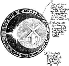
At this point I stopped playing with symbolic ideas and started juggling the form itself. It very quickly became clear that there was only one way to look at Skylab which would instantly establish its identity. No 3-D, no perspective, no cute angle shots — it must be a flat-on dead square silhouette. We would let the Skylab cluster become its own symbol.
It also appeared that there was something more here than met the eye.
 The silhouette shape of the cluster was a strikingly familiar symbol.
Was it an alchemical symbol, a religious sigil, or maybe a hex sign?
Every authority on symbols I showed it to said, “Oh, yeah,
that’s a ... er??” And so far no one has identified the
original in spite of the sense of familiarity. The only thing
we’re sure of is that it is not alchemical or astrological.
Many magical symbols come close, but don’t quite make it. Very
curious indeed.
The silhouette shape of the cluster was a strikingly familiar symbol.
Was it an alchemical symbol, a religious sigil, or maybe a hex sign?
Every authority on symbols I showed it to said, “Oh, yeah,
that’s a ... er??” And so far no one has identified the
original in spite of the sense of familiarity. The only thing
we’re sure of is that it is not alchemical or astrological.
Many magical symbols come close, but don’t quite make it. Very
curious indeed.
The shape being decided, the possibilities became more manageable. Should we emphasize the relationship of Skylab to the Earth, or relate it to the sun, in recognition of its unique solar laboratory. Let’s try both.
Among the suggestions the astronauts had made was the idea of a solar eclipse as seen from Skylab. It soon became clear that this idea would solve several problems at once: it pointed up the solar study function of Skylab, it would give me the large circular shape of the Earth as counterpoint to the angularity of the cluster, and it would establish firmly the connection of Skylab to the Earth. In addition, it would give a chance to get the necessary high contrast for good visibility of the tiny finished patch.
As for color, I would want to use the blues, browns and violets of Earth, the cluster would be black, and we would suggest the riches of the universe by backing them up with the sun’s rays in shades of gold, from yellow to russet. But just in case I was thinking too conservatively, we’d try a few in bright reds and oranges too. The solar flares and loops might be a nice touch if it didn’t get too busy.
Meanwhile, thoughts of a motto had been buzzing in my head.
“Out of this world” — naturally.
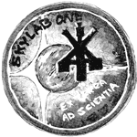 Maybe it would need the qualifier “for the good of the world”
— all in my bastardized Latin, of course. Ad Auribus in spatio
would be lovely, but it really wouldn’t do, I suppose.
Maybe it would need the qualifier “for the good of the world”
— all in my bastardized Latin, of course. Ad Auribus in spatio
would be lovely, but it really wouldn’t do, I suppose.
“We thought the motto ought to be in English,” remarked Commander Kerwin. “Latin might put people off. We were thinking of ‘Replenish the Earth’.” The possibilities of that one didn’t bear thinking about. We kicked it and a few others around for a while and then decided against using a motto at all.
I worked up rough color versions of several ideas and sent them off to Houston. It developed that my own number-one choice was running neck and neck with a pretty one featuring the diamond ring effect. With rare good judgment the astronauts had unanimously selected the two best designs out of some eight or ten sketches.
There was only one reasonable solution: I didn’t want to push my own choice — it was after all their insignia. I made large renderings of both designs, being very careful to emphasize the best features of each. I meant to be sure that the choice made would be based on the actual merits of each design, not on what we hoped it might be.
As before, the astronauts picked the right design. The alternate was unquestionably a prettier picture — but it lacked the carrying power and the impact of the one chosen.
From there on all was straightforward going. I made several studies of cloud patterns on the planet, reducing them finally to very conventionalized swirls. The Skylab cluster was simplified and simplified again, till it became simply a blackform with a white edgelight to set it off.
Being a naturally lousy letterer, I did the lettering roughly 483 times before I got it somewhere near right, and then discovered that I had reversed the ei in Weitz. Doesn’t sound like much of a problem until you realize that it changes the spacing of all the letters in the name, and shifts all three names a few degrees left, which meant also adjusting the background to give adequate contrast.
There was one interesting factor in the development of the lettering. If you will glance at the patch, you will notice that there are three radiant centers with which to deal: the Earth center, the sun center, and the center of the patch. Now: without looking, from which does the lettering radiate?
Yes, it had to radiate. Rectangular lettering would have worked around the rim: you simply use a radius as the center vertical of each letter, and space them normally. Once you move inward from the firmly established band of the rim, however, the optical tension changes. Your own eye insists that the verticals become concentric, because your whole visual orientation is toward the center of the circle.
Which center point? Would you believe a fourth?
I did a careful rendering in black and white, to make it easy for the manufacturer to follow my strokes, in setting up his embroidering machines. In machine embroidery, colored threads are stitched onto a backing material according to the desired pattern. The design is usually laid out on a grid with colors indicated by number. There are roughly five hundred shades of thread available for color matching. The setup man for the machine translates this coded grid to a punched tape very much like a computer tape — except that to me, at least, it looks ten times more complex.
The tape tells the machine what thread goes where, and what direction it should move, on the visible side of the fabric. What happens on the back of it, nobody cares; it’s when threads start going in all directions on the face that it gets messy.
Ideally, each stitch should be directly related to the shape it is helping to fill — that is, a radial shape would be radial stitches, a rectangular shape with horizontal or vertical stitches, a diagonal with diagonals, et cetera.
Years ago, I had a friend whose job was setting up such machines, and some of the descriptions he had for artists who failed to take his problems into consideration are still, in this permissive age, thoroughly unprintable.
The black and white guide being finished to a more or less satisfactory degree, I made a color drawing to match, so the setup man would know exactly what I intended. I wasn’t concerned with doing an attractive picture so much as with getting a good finished embroidered patch.
We shall see what happens ...
After making copies for my files, I sent the finished product off to Houston. A few days later, I was rewarded by an enthusiastic approval, with one slightly embarrassed demurrer. “We need — I do hate to say it — a letter from you promising not to commercialize the design.”
“No problem,” I replied. I had traveled this route before. A letter was immediately sent off.
A couple of weeks later, I made an equally embarrassed call to Houston: in my eagerness to make the patch easy for the manufacturer to reproduce, I had completely forgotten to do a definitive version for publication! I did one quickly, in pen and ink, and shipped it off.
But Commander Kerwin had the last word. He invited me to the launching of Skylab One as a guest of the astronauts, and enclosed his check for my work.
And forgot to sign it!
This article was originally published in the June 1973 issue of Analog Science Fiction/Science Fact magazine. It appeared on pages 10-19, and is reproduced here by permission. It is Copyright © 1973 by Frank Kelly Freas.